Final Flight


Here we have it, my final. I worked my butt off to finish this on time and I'm so very proud I did. This is one of my favorite pieces I've done as I feel I accomplished all my goals. My butterfly works very well with the background and it DOES resemble the reference quite well. I loved the leaf existing to give the piece a good sense of unity. Everything looks like it belongs and everything seems to balance out. I enjoyed this piece a lot as I feel I used skills from my old chalk pastel butterfly piece and incorporated new skills I was working on learning. I had fun working with the challenge of the black oil pastel with light colors surrounding it. Those were a fight to blend but the challenge was kinda intriguing and taught me how to plan for those issues.
Global Warming Social Issues
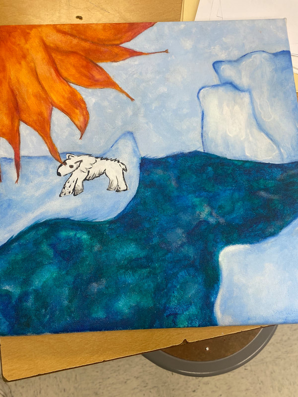
For this project I took on the idea of global warming causing destruction of the Arctic. This project was fun to begin as we worked towards learning how to stretch canvases. This was fun and a interesting aspect of art. I did good to begin with on this project I feel but as the deadline came up I wasn't quite ready for it. I did very good on using good tones for the ice but by the time I got to actually doing my bear in paint I was quite low on time. This was my own fault of time management and working on creating ice or water is something I'd definitely work on improving in the future.
Silk Screen Printing


For this project, I struggled a lot with clogging. This was quite fun working with the press though as it helped me learn a lot about printing even if it isn't my cup of tea. The squeegee was fun to use and I liked messing around with all the different colors of ink. My struggles really were with the ink and I wish I could figure that out sooner to get nicer prints before the project was so late in.
Fall Final-Oil pastel


This is my final, I used oil pastel to create this piece. I'm quite content with this piece as it has lots of vibrant tones. I used rubber blenders and this was a major help as I didn't smear colors around unintentionally nearly as much as when using my fingers to attempt to create value. I had a nice bit of contrast and overall I'm at peace with this as a final. I love how the stairs turned out as they were mono-toned originally but towards the end I noticed this would offset the balance within the piece and worked on problem solving that situation. This piece was originally a piece about acceptance/welcoming in diversity but as it went along and I began to form this piece it really felt more like a self interpreted piece.
Graphic Art


So far in the project of graphic art I've completed a Winnie the Pooh outline. I don't know how this is going to go overall as I have NOT enjoyed the digital aspect of this project as we begun it. Well well well, I've completed the project and honestly it wasn't the most enjoyable. I didn't like working with Illustrator as it didn't feel very personalized and more of just a digital ability. I didn't like the idea of just using a little pen tool to make and form lines as I didn't get to draw anything necessarily beyond just my sketch.
Fauvism


This is my fauvism image of Emma Watson. I struggled to do this project as this style of oil pastel is entirely different from what I'd normally do. I used rubber blenders for the first time ever while completing this project and I think it helped greatly with my hair. It was definitely the best part of the project as it showed great forms of value and depth in the project. I wish I had more time to complete minor details Emma had, but I don't feel this is the worst I could've done.
Large scale butterfly/Georgia O'Keefe!


Well, here we have it. My butterfly. I definitely enjoyed this project as the factors of working with chalk pastel and charcoal were more in my alley. I didn't struggle too much to work with the value and I was able to be quite creative with it. Though we did have some struggles finding proportions in my wings early in I feel as though it turned out quite well and as though this is one of my best large scale pieces of work especially since I didn't blend with any paper blenders.
Sketchbook!


This is my sketchbook for my Junior year. I've worked hard on becoming better strategically with threading. I loved the different values to my end pages along with the way the spine turned out. Though I wish my signatures were more evened out, my cover has a very cute theme to it along with the thread matching the color tone.
